|
|
|||||||
| Register | All Photos | FAQ | Members List | Calendar | ShopStream (Radio/TV) | Search | Today's Posts | Mark Forums Read |
| Knife Photography Discussion Share and improve your techniques on knife photography. Web and print imaging discussions welcome. Come on in ... |
 |
|
|
Thread Tools | Display Modes |
|
#1
 12-06-2009, 12:00 AM
|
||||
|
||||
|
Trying BackGrounds!!
Hi I Tried to Add Some Background to this Photo. Something Wrong? Please Advise.
Photo 1: 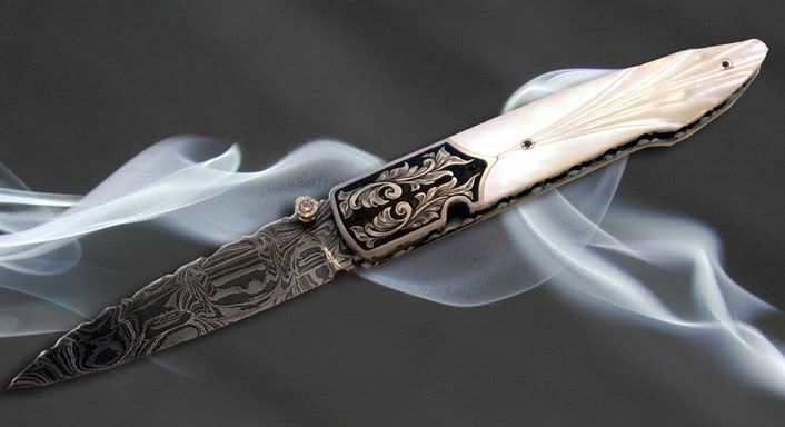 Photo 2: 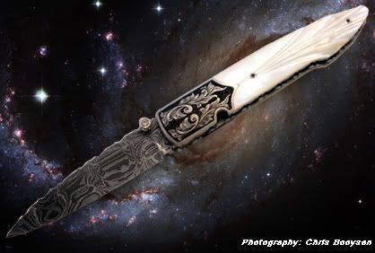
__________________ ChrisB. chris@cbknives.com www.cbknives.com "If you are patient in one Moment of Anger, You will Escape a hundred Days of Sorrow." 
|
|
#2
12-06-2009, 01:17 AM
|
||||
|
||||
|
Another Background and Composition,
__________________ ChrisB. chris@cbknives.com www.cbknives.com "If you are patient in one Moment of Anger, You will Escape a hundred Days of Sorrow."
|
|
#3
12-06-2009, 08:27 AM
|
||||
|
||||
|
Quote:
|
|
#4
12-06-2009, 01:27 PM
|
|||
|
|||
|
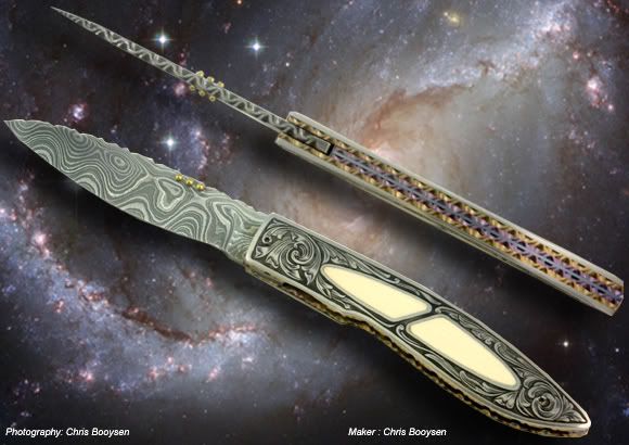
Chris, I think with the first picture, it's more the crop than anything else. I would make the picture about 2 or 3" longer, more like the second pic. This will give a more pleasing perspective. You're progressing nicely and each picture shows improvement. The other thing to consider is make sure you do your adjustments on the knife pic with adjustment layers as you will then be able to adjust (knife only) for brightness, contrast, hue, saturation, etc.. You can also do some adjustments later if you leave your adjustment layers open (use layers as you can always go back in and re-adjust as needed). The second photo is too dark near the tip of the blade, but that is an easy fix. Your backround will be a separately layer and can also be adjusted separately with layers as needed. Hope this helps and doesn't confuse you. Barbara
P.S. You're second post is nice but needs a contrast boost and a little more sharpening. Last edited by Barbara Turner; 12-06-2009 at 01:29 PM.
|
|
#5
12-07-2009, 10:27 PM
|
||||
|
||||
|
Barbara, Thanks a Stack!! Will Keep it in Mind for my Next Session.
__________________ ChrisB. chris@cbknives.com www.cbknives.com "If you are patient in one Moment of Anger, You will Escape a hundred Days of Sorrow."
|
|
#6
01-07-2010, 02:42 PM
|
|||
|
|||
|
I thought I was going out on the limb using this background but noticed that my eyes quickly dismissed it and began to focus on the piece. An area where it is easier to focus. Before I even shot the image my thinking was that the background is so darn busy and of small, tightly bound detail that it might not be so bad. The image is a bit over Photoshopped but I am sure you can see what I mean. Does it work the same for you folks or is it just me? It isn't something that I would consider using often in a closeup but it does get you to wondering about other possibilitys.
Greg 
Last edited by mckenna; 01-07-2010 at 03:00 PM.
|
|
#8
01-11-2010, 12:07 PM
|
|||
|
|||
|
nice pictures man

|
|
#9
01-11-2010, 06:22 PM
|
|||
|
|||
|
Greg, I prefer the 2nd shot to the first. I love the texture in the second without the slight distraction of the first backround. Nice job. Barbara
|
|
#10
01-11-2010, 09:09 PM
|
|||
|
|||
|
I agree with you Barbera. The 1st image more or less forces your eye to the center mainly to seek relief while the 2nd shot works with the image. I was just thinking about how a background that has a very busy area, not the entire background but just a part of it , could be used to draw attention to a specific point.
Thanks, Greg
|
|
#11
01-11-2010, 09:26 PM
|
|||
|
|||
|
As dreary as wood is, it is not reflective and can add a rustic sense to a photo. Seems to work well with darker subjects too. Still gettin' the hang of this camera and my lights.
Greg 
Last edited by mckenna; 01-11-2010 at 09:51 PM.
|
|
#12
01-12-2010, 12:46 AM
|
||||
|
||||
|
Nice work Greg. The first image only works because of the simple plain-ness of the knife. If it was a damascus knife with abalone scales, it would be a train wreck....
 As you graduate down to less busy backgrounds you can add a busier knife. Not a hard rule of thumb, but a consideration. Your lighting is great. Nicely accomplished. Cool!  Coop __________________ Jim Cooper - Capturing the Artistry and Significance of Handmade Knives  ?? New website improvement for 2010 - Over 5000 images searchable by maker's name! ??
|
|
#14
01-14-2010, 08:41 AM
|
|||
|
|||
|
This knife has been giving me fits with it's different hues and overall color. I tried a dozen different colors of background and finally settled on this one. Instead of looking at the piece in a overall manner, I just tried to connect the background with the trace of yellow/gold in it. Any suggestions?
Greg 
|
|
#15
01-14-2010, 01:54 PM
|
|||
|
|||
|
I would prefer it if the backround wasn't quite as yellow / gold. I have included 2 re-works which show the different colors of the tweaked backrounds. I increased the detail on the backrounds and boosted the contrast on the blades. The one on the plain colored paper doesn't work for me at all, I would keep trying different colors and textures. Let me know what you think, Barbara
 
|
|
| Tags |
| blade, damascus, image, knife, lights |
| Currently Active Users Viewing This Thread: 1 (0 members and 1 guests) | |
| Thread Tools | |
| Display Modes | |
|
|


 Linear Mode

